
As you may or may not know, my bedroom walls are currently pink. By no means do I mean girly, pastel, ballerina pink - I mean bright peachy, in-your-face pink and, since I painted it seven years ago, I would have it no other way.
But as I said, I did it seven years ago (in my preteens - when else would one paint an entire room bright pink) and I never thought much of it until last March when the "Power of Pink" House Beautiful issue appeared in my mailbox. I rarely save magazines after I read them, but this one really struck a chord with me - looking through the stories in the well of the magazine, I could not help but fall in love with each and every one of them - the pink seemed to make the spaces happier, warmer and more optimistic. Since then, I have become slightly obsessed with the range of the color, and different ways designers and stylists use it in spaces.
With that said, I feel like pink is often a taboo color in home decor - women seem to be worried about offending men by using such a feminine color, but with so many 'real mean' wearing pink these days, how could that be? In fact, before the 1940s, pink was associated with baby boys! So, as you look at the images below, think of your husband / boyfriend / father / brother / friend and imagine them in the spaces. Here's to the boys:

A perfect combination of my two loves - pink and gallery walls! (and the chevron on those chairs...)
From pinterest
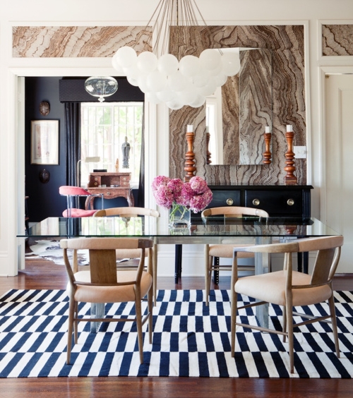
If you lose the pretty pink flowers, this space is the epitome of metropolitan masculine (but cover them up and you will see how much warmth the tiny bouquet adds - the space feels incomplete without it). I'm also loving the Madeline Weinrib carpet, the mod chandelier (similar here and here), and the faux bois wallpaper.
from Jaclyn Paige Tumbler

This bedroom is certainly a vision of femininity - from the lines of the furniture, to the color of the bench, to the Prada Galleria bag (duh), but look beyond those and all you see is black, white, blue, gray, gold and brown. The colors of the space assist in balancing the gender see-saw and make it comfortable for all (the gold horns help too).
From La Dolce Vita, Interior Design by Spazio Rosso

Vogue recently featured this entryway, which belongs to the actress Amanda Peet. How welcoming is the vintage pink rug?
From La Dolce Vita
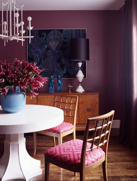
Such a warm, moody example of pink. I love the blend of modern lighting and vintage furniture - it allows the room to feel more alive and lived-in. The fabric on the chairs (gorgeous, right?) is from David Hicks La Fiorentina.
From Decor Pad

Isn't it amazing how such a small amount of pink completely changes the space? The best part: by only using it on the pillows you can constantly change the entire ambiance depending on the season, your mood, or even your house guests!
From At Home in Arkansas
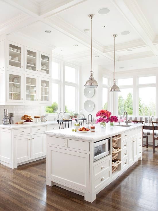
This kitchen is the epitome of my style - bright, open, mix of old and new, clean, and fresh, without completely giving into trends. The pop of color makes it even more irresistible.


