I'm at the Jersey shore for the weekend and can't help but think of the last time I was on a beach: two years ago I studied abroad in Florence, Italy and went to Cinque Terre for a weekend. I figure now would be a perfect time to share a bit of Cinque Terre with you.
8.11.2012
8.07.2012
Kitchens: What You See is What You Get
When designing (or re-designing) a kitchen, don't forget to consider open shelving. These systems not only make kitchens feel more open, larger and brighter, they also allow your collection of tableware to serve as usable art, in a casual and approachable sense. Even more, they're certainly budget friendly. As with any design element, it's all in the details - be sure to think about brackets, the material, and the size of the shelves, as well as what you put on them.
Here are some stellar examples:
Instead of installing bulky cabinets to hide her beautiful collection of off-white tableware, interior designer Lauren Liess decided to show it off! My favorite things about this room are the contrasting black brackets (similar here and here). And - could the chalkboard fridge possibly be more amazing? I totally envy that boy!
Here are some stellar examples:
The open shelves here allow the kitchen to feel larger and more airy - doesn't the whole space seem to breath so peacefully? (similar shelf here)
Designed by Molly Fray Designs
I chose this image because, unlike the previous, the shelves seem completely un-styled - just stacks of plates and a cluster of mugs. My biggest fear about open shelves was the thought that I would need to 'style' them every day, but this shows that even stacks can be completely beautiful in creating a comfortable setting.
Instead of installing bulky cabinets to hide her beautiful collection of off-white tableware, interior designer Lauren Liess decided to show it off! My favorite things about this room are the contrasting black brackets (similar here and here). And - could the chalkboard fridge possibly be more amazing? I totally envy that boy!
Designed by Lauren Liess Interiors
Orange is the name of the game in this deliciously warm kitchen, and the open shelves (painted yellow inside) break up the would-be monotonous color. It's pretty perfect, no? Also, I love how the shelves are used for cookbooks and spices instead of simply tableware - this adds color and visual interest.
From Live.Love.Create
OK fine, I'll admit it - I chose this kitchen first because I loved the tile, and second for the shelves (But can you blame me? These tiles are fantastic! They are called Nottingham and are made by Ann Sacks). I love the one simple shelf and how it continues the line of the hood to break up the height of the wall.
Built by Structures Building Company
A few tips to remember:
- Tableware, cookbooks, spices, etc. are best - try to avoid food
- Allow everything to breathe visually - space between objects is important
- Plates (heavy) go on the bottom / glasses (light) go above
- A colored background provides contrast and can highlight the style of your dishes
(Derived from Apartment Therapy)
Good luck!
-Melanie
8.05.2012
All-Americans
In the midst of olympic fever, American pride is sweeping the nation. Nationalism is suddenly 'in vogue' as we come together to root for the home team. With that said, I thought it would be fitting to have an American themed post, but that seemed to stump me - what exactly is our American design style? Is it:
-a space filled with products made solely in America?
-a style lacking foreign influences?
-a room that serves as a melting pot of foreign influences?
-an abundance of red white and blue?
-a white picket fence around a 'country' home?
Now do you see my issue? Is a house in the heartland with a farm in the backyard more American than a condo on the beach in Florida, or a brownstone in NYC? I say no way! Country Living Magazine says there are five major elements to American style: collections, layering, fresh color, florals and comfort (the last of which, I couldn't agree with more).
A home is what you make it, and here are my favorite 'All-Americans":
A home is what you make it, and here are my favorite 'All-Americans":
Such beautiful collections deserve to be displayed - they add a sense of who the home owner is, and give depth to the space (mixing old and new is always best).
From Country Living
Layering of patterns, depth of color, and old/new.
From Country Living, Photo by Miki Duisterhof
The jewel toned colors in this living room are saturated to the most beautiful level, and they help the art and antiques take on a new life. The neutral wall and floor help balance them and make them cohesive.
From Elle Decor, photo by William Waldron
When I think floral I think old ladies, simple as this. This room, covered in Lily Pulitzer, is anything but that - it is fresh, young, and totally American!
From Lily Pulitzer Home
Who's more American than Ralph Lauren? This vignette, taken from his Spring 2012 collection, looks like the epitome of comfort, right?
From Ralph Lauren Home
Good Luck Team USA!
-Melanie
Labels:
America,
collection,
color,
comfort,
country,
Country Living,
floral,
layers,
Lili Pulitzer,
Ralph Lauren,
USA
8.02.2012
Private Sale Alert - Serena and Lily!
Serena and Lily is one of my absolute favorite home decor companies - their well-traveled, cozy, fresh aesthetic is so on trend and their pieces adds warmth to any space. You can imagine my excitement when I received a postcard in the mail about their private sale (you didn't hear it from me!). Check it out here - www.privatesale.serenaandlily.com
Here are a few of my favorites from the sale:
The Sand/Navy Canyon sheet set is so classic - I love the arrow motif along the edges and the color palette. ($100-$200)
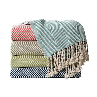
Is it possible for these Herringbone Throws to look more cozy? I know, it is hard to even look at them in the middle of this August heat, but come October they will be a dream come true. ($158 from $250)
Shiny, metallic, silvery strips of leather woven into a rug? How could I say no? This Metallic Suade and Hemp Rug adds a hint of glamour to any space, but is subtle enough to not take over a room. It's perfect! ($175 from $250)
This is too cute for words. As a serving tray, a pop of color, a centerpiece and a way to add height to a table, this Pedestal Tray is certainly a jack of all trades. ($55 from $78)
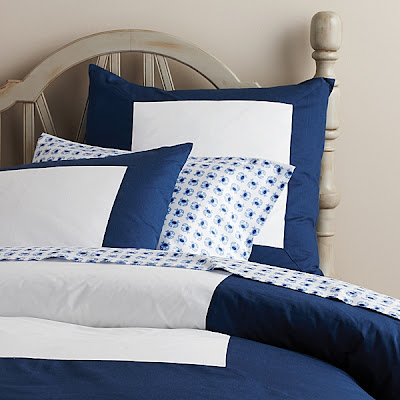
Shopping in the Kid's section is crazy you say? Not if you can find a queen sized duvet for $70 (from $140)! This Navy Color Frame Duvet has such a classic, streamlined look it is sure to please anyone, ages 4 to 94! Also comes in hot pink, light pink, light blue and lime green.
Enjoy and let me know what you buy!
Melanie
Labels:
duvet,
herirngbone,
Metallic,
pedestal,
rug,
sale,
Serena and Lily,
throw,
tray
Subscribe to:
Comments (Atom)


